


"I'm very much a word person, so that's why typography for me is the obvious extension. It just makes my words visible"
-- Erik Spiekermann
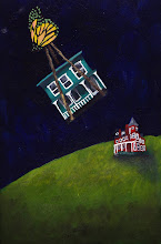
I'm celebrating 100 entries with a tribute to text. With degrees in Art History and English Literature, I love when they are married through illuminated manuscripts, initial capitals, or even the perfect font. Edward Gorey, one of my favorite illustrators, has produced several alphabet books, not only creating ghoulish illustrations but his own handlettered font. Alphahouses, an alphabet book I wrote and illustrated, used alphabetic creatures entwined in their homes, each of which welcoming the reader with his own brand of hospitality.
There's a lot to be said for the perfect font. There are times when only an old-fashioned typewriter will do, while at other points, you know you need sans serif--- STAT! When Bouler Design Group first started, our graphic designer Maureen Mooney introduced us to the latest fonts around. We fell in love with Gill Sans and Futura Bold-- both very modern fonts which made a visual statement. For those who love fonts, I'm including a few sites to peruse: ilovetypography.com, welovetypography.com, and my fonts.
It's no coincidence that the look of the typesetting has a huge influence on the overall impact on the text's meaning.


2 comments:
I love fonts too! I love the ones you shared here. You just reminded me of a font I invented a few years ago and forgot about. I think I'm gonna dig it up and do a post about it. Also, don't know if you are familiar with this site already, but they have great fonts too: www.dafont.com I used some of their fance western fonts for my friend's album cover.
I'll definitely have to check it out-- thanks for the tip
Post a Comment