


"I'm very much a word person, so that's why typography for me is the obvious extension. It just makes my words visible"
-- Erik Spiekermann
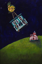
I'm celebrating 100 entries with a tribute to text. With degrees in Art History and English Literature, I love when they are married through illuminated manuscripts, initial capitals, or even the perfect font. Edward Gorey, one of my favorite illustrators, has produced several alphabet books, not only creating ghoulish illustrations but his own handlettered font. Alphahouses, an alphabet book I wrote and illustrated, used alphabetic creatures entwined in their homes, each of which welcoming the reader with his own brand of hospitality.
There's a lot to be said for the perfect font. There are times when only an old-fashioned typewriter will do, while at other points, you know you need sans serif--- STAT! When Bouler Design Group first started, our graphic designer
Maureen Mooney introduced us to the latest fonts around. We fell in love with Gill Sans and Futura Bold-- both very modern fonts which made a visual statement. For those who love fonts, I'm including a few sites to peruse:
ilovetypography.com,
welovetypography.com, and
my fonts.
It's no coincidence that the look of the typesetting has a huge influence on the overall impact on the text's meaning.


 Ever since I've started working on collages, I feel the impatient need for a manual typewriter. I've always loved using text in images, and nothing quite compares to the mark making of a typewriter's key stroke. After a quick internet search for a manual typewriter, I realized none would carry as much meaning as if I retrieved my grandfather's 1922 Underwood Noiseless from my parents' basement and refurbished it. My grandfather, Giuseppe Ferretti, was a mechanical man. As a young boy in Italy, he would scour the junk yards for bed springs, reconfigure them, and fix clocks with them. Later, he invented an instrument called the shovelene, a combination bass guitar, violin, and horn instrument. He invented contraptions for the kitchen, guillotine clam openers, spatulas out of stainless steel, napkin holders, so fixing his typewriter with a can of WD 40 seems quite appropriate. As far as typewritten text in collages, Ray Johnson's use of text and image fueled his Correspondence School, with his typewritten letters crossing into conceptual art. Now all I need to do is find a ribbon.


